The marks of
faith with reason.
Everything on this page is for you — writers, churches, developers, and friends who want to point at Feason accurately. Take the assets, keep the guidelines, and if you need something that is not here, just ask.
One logo, two grounds.
The Feason mark works on our warm dark ground and on light paper. Give it room to breathe and leave it exactly as drawn.
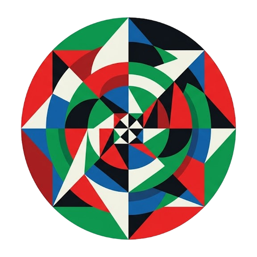
feason-logo.png
512 × 512 PNG with transparency — the same mark that signs every page of the site and the iOS app.
Download PNGFaith & Reason, in one word.
The name is a portmanteau — and a thesis. Write it as one word, capital F, in a Garamond when you can.
Candlelight, not neon.
A warm dark ground, three liturgical accents, and antique gold for ornament. These are the exact values the product ships with.
Liturgical tri-color
The three accents that mark Feason’s sections — scripture, fellowship, and pondering each keep their own color.
#db4e43#6488d8#46a55eOrnament
Antique gold is the craft language — rules, numerals, drop caps, gilded edges. It sits above the tri-color, never instead of it.
#c0a162#d9a94cGround
The warm, candlelit surfaces everything sits on — closer to an old reading room than a screen.
#171411#1d1a15#f0e7d5#a89d89Two Garamonds and a workhorse.
All three families are open source on Google Fonts — nothing here is licensed away from you.
EB Garamond
Serif — reading text and navigation
Come now, let us reason together, says the LORD.
Cormorant Garamond
Display — headlines and large settings
Faith & Reason
DM Sans
Sans — labels, captions, and interface
Edification, minus reactivity.
Point at us plainly.
You do not need permission to reference Feason honestly. You do need to leave the marks alone and never imply we said what we did not say.
- Use the logo to link to Feason or identify it in press, articles, and reviews.
- Keep clear space around the mark — at least half its width on every side.
- Set the mark on our ground colors, or on any calm surface with enough contrast.
- Write the name as one word with a capital F: Feason.
- Recolor, distort, rotate, outline, or add effects to the mark.
- Imply sponsorship, partnership, or endorsement by Feason.
- Combine the mark with your own name or logo into a new lockup.
- Use the brand on content that conflicts with our community guidelines.
Need something else?
Higher resolutions, a different format, or a question about a use we did not anticipate — write to us and we will help.